This poster is advertising Ellie Goulding as a successful artist. She is in the centre of the poster, depth of field is used to make her stand out against the dark background. This picture is a unconventional way of showing her profile, because she is looking up it draws the viewers attention to the typography at the top of the poster which is important as it states the artists name. A white font is used to advertise her name and success stories, this stands out in front of the dark background colours. Then there is a golden font which is thin which tells the viewers about her songs and comments from magazines and newspapers. I would like to also have my main artist in the centre of my poster having a dark background and using brighter font.
This poster is advertising Rihanna's new album 'Rated R'. It is very basic, everything in black and white except from the red font at the bottom of the poster advertising bands she's worked with in the album. Different typography is used throughout the advert. Rihanna is wearing heavy make-up with black eyes and black lips. This is not her typical style, she is going with a grunge/ punk style compared with her girly, high fashion clothes. She takes up 75% of the poster, it look's like she is looking directly at you what draws the viewers in. In the top right conner is Rihanna's logo which is displayed on most of her cd's and posters. The picture has been edited to give a more of a glossy look.
This this an advertising poster, promoting Gwen Stefani's new and upcoming album. Firstly the poster mainly consists of an close up image of herself sitting on a chair. She is sitting laid back and her expression on her face is very seductive. The picture is blurry which makes the yellow font stand out, the dominant colour is white toward the bottom on the advert which also makes the typography stand out. This is a conventional advert as the picture of Gwen Stefani is dominating the poster so you instantly know who it is, then in clear big font there is her name and album name all promoting her.
As you can see below, i have screen grabbed a picture from the internet of Gwen Stefani's album cover. This image is the same as the poster except the full version. Unlike the Digipak cover the poster has been cropped.
This is a poster advertising Lady Gaga's new upcoming album.The poster is split up horizontally in 3 sections, the images used are bold and eye catching. The two images of Lady Gaga are very different, the top photo is very strong, the black and white work well together contrasting to make the image powerful and unique.The bottom image is slightly faded, and more pretty looking. Both pictures used in this advert are used to make to different covers you can purchase. The typography is bold and stands out over the faded image, this makes it eye catching and the audience can see the text clearly. Lady Gaga's name is displayed in a very large font and the information on the bottom section is a much smaller font. The middle section contains a quote from the rolling stones magazine this gives the audience an idea of the upcoming album.
Her dress sense reflects her uniqueness, as there is no artist is like her, she stands out by wearing very bizarre, weird outfits and a lot of people would class her as a fashion icon. I think she has a big target audience, she is in the pop genre, which normally has a female target audience. But i find it hard to pin point an age as people of all ages could look up to her as a role model as she is different and doesn't care what people think. Men could also like her as she has the sex appeal, she wears revealing clothing and and sexual in her songs and videos.
Noah and The Whale, The First Days of Spring- Poster
This is a poster promoting Noah and The Whale, it contains the name of the band, name of the album, reviews, album release date, and the record label. I like the pastel colours used and the natural outside location which i think suits the indie category. The main singer i holding a telescope and is in focus compared to the other band members, their all wearing shirts which gives them a smart individual look. I think the picture used relate well with the album title e.g the long grass and the clear blue sky link to spring. The typography is in scroll which i think also goes in well with the album name. I think Noah and The Whale have a big potential target audience, this is because their music is broad, although they focus on the indie genre they have a few songs which can sound like pop music and some sounding folk. As they are very attractive and a good dress sense i think they will be liked by mostly females. The information is towards the top of the poster this is because of the clear light blue background making the black typography standout.
The Courtneeners used this poster to promote one of their albums. A simplistic idea is used for this poster, the front cover is mostly dominated by a cartoon drawing of half a persons face. The cartoons eyes, ears and head are outlined in black then the lips are in red. The poster although advertising the band doesn't hold any information on it e.g. tour dates, album releases. The colours are eye-catching as the graphic in the middle is bordered with a sharp red colour. The typography is simple, it is based on the top red border and in white which stands out against the cold red.
This is the album cover for Lady Gaga's cd 'The Fame'. A large image of herself 'Lady Gaga' fills up the cover. The black hood she is wearing makes her fair complexion stand out. The name of her album is written onto her sunglasses in white with a serif writing, this contrasts against the black. Then artists name is along the bottom in red, this is in a sans serif typography and because of the colour stands out.
This is Kasabian's front cover of their Digipak, the cover contains a king like figure holding a naked women, this is mirrored top to bottom, both joining to complete the image. It looks like a playing card, this is highlighted with the inclusion of the K of clubs sign in the top left hand corner. I think this image ties in well with the alum name Empire. The background colour is beige which makes the image stand out. The typography is sharp and basic, it covers the majority of the centre of the cover. The colour is gold which fits in well with the existing colours. I think because Kasabian being band, there faces arn't as easily recognised as their name, meaning having their name across the front cover will be easily recognisable for the audience. The name of the album 'Empire' is featured much smaller in white on a red ribbon that is tired around the bottom half of the centre image.
This is the Digipak opened up, the beige background is carried on with the simple K of clubs sign on the left and on the right the details about the songs e.g. the song and music writer. The typography is black, curvy writing and small.
On the back of the Digipak is the list of songs included in the album. I like the gold victorian style design which links in with the theme throughout the Digipak. The typography is small red writing with the same font used as the inside.
This close up shot of Rihanna on the front cover will immediately draw attention to the CD as she is very well known. I think what makes this Digipak stand out is the fierce bold red colour of her hair and lips. This red colour scheme has been incorporated throughout the Digipak. The red roses on the inside pages contrast well against Rihanna's skin. Her red lips are empathised to look bigger making her look more seductive and draw in the male attention The font which has been used on the album cover is white, plain and simple.
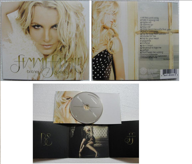
Britney Spears is a very famous female artist. Her main genre is pop which normally appeals to a younger audience, saying this as the digipack is quite simplistic she may be targeting an older audience in this album.
The front cover of the digipack is very light, Britney Spears is shown with a close up shot, she is looking directly at the camera. Her hair is wavy and she has heavy make up on. She is looking seductive which may draw male attention to the CD. Britney's name and album title are displayed in big letters, the font is very girly and in keeps with the gold writing theme. The main image takes up the most of the front cover, this is because she is well known, and who people will recognise, this may draw someone into buying it.The back of the Digipack also has Britney on, she is wearing a different outfit and looking away from the camera towards the list of songs. A window is in the picture, and the font is black to stand out from the light background. The inside of the digipack is very simple, on the left panel is the initials of her name and on the right is the initials of her album. In the middle panel there is a photo of Britney she is sitting down wearing a short dress, dark eye makeup and she is looking directly at the camera in what looks like a nightclub.
I think this is a very effective, simple digipack as it stands out, so fans looking at Cds will notice her cd straightaway. This close up of Leona Lewis's face is very seductive and sexy, her lips are emphasized and her hair is made up, thereby perhaps appealing to males. The white typography of Leona Lewis's name stands out in contrast with the dark background, meaning it is noticeable for the viewers, as well as the yellow typography indicating the name of her album.
This is very simplistic but works well, the yellow typography stands out. The songs included in the album are printed on the cd which is rare. I want my cd to be similar to this as i'm considering having a stand out picture on the front cover of my digipack and i think it may be too much if i have a picture on the cd.
Same goes to the back of the digipack, very simple, the animation of the flowers going down each side is girly, pretty and adds something to the cover. The white font is small but stands out against the black background. I would consider using a type of animation on my digipack.
I like the way depth of field is used here, she in in focus and the background isn't therefore makes her stand out. Beyonce is looking very seductive and sexy, her lips have been enlarged, and she is wearing a low cut dress showing her cleavage, this may attract a male audience. For being outside she is wearing heavy make up with dark black eyes and has her hair up. The white typography stands out over the dark green background, the font is girly and i like the thin animated swirls around it. Having a clear picture of Beyonce taking up the majority of the Cd will attract fans and people in general as she is very well known.
This is a very plain Cd, the background colour is beige which makes the white typography stand out. The cd contains Beyonce's name and album name, again with animated swirls round the font, the songs in the album, and the information on manufactures e.c.t.
This is a close up shot, i think it works well as it introduces the viewers to the artist, and because of her fame people will recognise her straight away. The composition of this shot only contains the artists face and hands, she is wearing make-up, her eyes are very smokey and she has lipgloss on, this goes with the song title "all about tonight" as it is the type of makeup she would wear on a night out. The shot is very detailed and the lighting is very bright, you can see her seductive look which draws attention to the male audience.
Two scenes have been have been merged together by a editing technique, the close up shot of Pixie Lott and the shot of the destination is a long shot so you can see the detail and try and work out where the location is.
To show the full location/scene a long shot is used here, this also allows the viewers to see the many dancers, the artist and the various props. Costumes are up-to-date and glamorous, and of what i can tell i believe the location is in a garage.
This is a medium shot, the composition again shows Pixie Lott stood in the middle of the many dancers which draws the viewers attention to her. I like how the location is in the middle of the street, and the dancers are all dancing in sync. Pixie Lott is wearing a more revealing outfit compared with the previous shots, this may draw more male attention to the video.
This is a medium shot of Pixie and her friends walking into a club. The colouring is quite dark however the bright light shadowing over the artist brightens it up. Pixie is in a different outfit again, her hair is also shorter. A light is shinning on her face which makes her contrast against the dark background, therefore standing out to get the viewers attention.
This is an establishing shot and is the start of the storyline. You can clearly see the two different houses next to each other, with lights on in two rooms facing each other. This gives an insight of one of the locations is the music video.
Here Taylor Swift is shown as a geek, she is wearing big glasses and a geeky top. This medium shot is shot from outside of the room looking at her through her window. The window panels fame her face, and the note pad she is holding up is a useful prop adding to the storyline.
This shows the montage of her getting changed. This is a behind the shoulder shot but because she is facing a mirror you can see her reflection.
I like the focus pull between her hands and him coming over. The viewers can clearly tell the boy coming over is a big part of the storyline because of the lyrics.
This is a close up shot, depth of field is used as she is in focus and the background isn't. She is dressed as a band member in this shot, this adds to the geek storyline in the video.
This is a medium shot, there is a change of location which you can clearly see is a prom. Having the dark figures standing each side looking at her draws the audiences attention straight to taylor.
This prop stands out against the black background. A close-up shot is used showing him holding up a piece of paper torn out from a note pad saying 'I Love You.' on it. This video is all about the storyline and this shot finishes it of.
I like this close up shot as you can see the dark confused expression on the subjects face, she stands out against the dark background.
I really like this animation, it starts with a black dot over the place of her heart and gets bigger until you can see a jar.
A smoke machine would have been used to create this misty, smokey effect. This medium shot although misty and unclear you can see the street location.
This is a strong medium shot, she is passionately claws the glass. I like how a there a blurry effect from the glass.
Because of the lighting and the plain white background a silhouette if the subjects under the umbrella is created. This is a medium shot.
The dancers are dancing in-sync with each other, this makes christina perri stand out as she is the only one not moving in this medium shot. The location is still the same (in the street) and the outfits of christina and the dancers are punk which doesn't quite go with the song but with the personal style of the Christina Perri.
I have looked at this music video a it fits in well with my chosen genre/style of music which i want to base my own video on. Many dancers are used to do the complex dance routines throughout the video which fits the pop/dance genre. Beyonce is wearing a lot of extravagant clothing to make her stand out from the dancers, there are many shots that pan around Beyonce to show off what she is wearing in detail. The location looks like an old, abandoned building, this is shown by establishing shots throughout the video. Beyonce's target audience has always been females and i think from the lyrics of the song and this video she is definitely aiming once again for the female fans.
I like this medium shot because it gives the audience an insight to the location. It has an urban feel to it because of the warm colours in it.
This shot is really impressive, made more so by the slow motion. I like the slight angle of the shot, making the landscape slightly tilted. She stand out as she is wearing a bright white outfit contrasting on a all black horse.
I really love the biblical imagery of this long shot, making it look like Jesus on the cross. One of the dancers are used in this shot. She is wearing a black dress and her bright white hair and silver belt stand out.
Beyonce's stance is very powerful here and dominated the shot. I like how the shot has been filmed on a hand held camera, adding movement to the shot. The colours are the typical roman empire colours. The lion in the shot makes it look professional and dangerous.
I like this close up shot, the gold head piece she is wearing frames her face. Her eyes are looking directly at the audience make them feel involved. You cant tell of the location in this shot but because of the same natural light i assume it is the same. I want to have a close up short like this in my video, using the direct effect and having my actress wear jewellery and heavy make-up.
This is a very busy shot, there are many people shown but not all in focus. I think this is cleverly shot because you cannot see the other dancer's faces, it draws your attention to Beyonce and her dancing. Her and the bizarre dancing grabs the audience's attention.
I like the low angle of this shot, showing a different perspective of the dancing. By filming from below, it makes the women seem more powerful. The dark outfits worn in the shot stand out against the light background.
Beyonce is wearing a long white dress which is not very typical for the deserts. The low angle of the shot makes her and the hyenas seem more impressive. Again the location is in the desert but different colours are shown like the pale blue sky.
Her silhouette here is really powerful compared to the bland background. The water is a good metaphor for her dominance.
This close-up shot works well as your eye is drawn to the left side of his face as the light is shining against it, meaning you can see the tear going down his face. The dark background is in contrast with the light face.
This long shot shows the audience the location of the next couple of shots. The black and white floors go well with the monochrome setting as they really contrast against each other. I like the big window in the shot bringing natural light into the room.
This is a birds eye view medium shot. This allows to see the many men sitting round the table and whats on it.
This close-up shot works well, because it allows the views to capture all the emotion she is showing and brings a storyline to the music video.
This is a medium shot, she stands out as she is central and contrasts against the males in white.
In this medium shot natural light is used, her black dress makes her stand out as she is in contrast with the light background. I like how the audience can see the location.
This is a medium shot, the synchronized swimming gives a unique style to the video. The swimmers stand out as the are wearing white costumes, so contrast against the dark background.


