Monday, 26 September 2011

The Courteeners, St Jude- Poster

The Courteeners, St Jude- Poster


The Courtneeners used this poster to promote one of their albums. A simplistic idea is used for this poster, the front cover is mostly dominated by a cartoon drawing of half a persons face. The cartoons eyes, ears and head are outlined in black then the lips are in red. The poster although advertising the band doesn't hold any information on it e.g. tour dates, album releases. The colours are eye-catching as the graphic in the middle is bordered with a sharp red colour. The typography is simple, it is based on the top red border and in white which stands out against the cold red.  


Lady Gaga, The Fame- Digipak

Lady Gaga, The Fame- Digipak


This is the album cover for Lady Gaga's cd 'The Fame'. A large image of herself 'Lady Gaga' fills up the cover. The black hood she is wearing makes her fair complexion stand out. The name of her album is written onto her sunglasses in white with a serif writing, this contrasts against the black. Then artists name is along the bottom in red, this is in a sans serif typography and because of the colour stands out. 

Kasabian, Empire- Digipak

Kasabian, Empire- Digipak

This is Kasabian's front cover of their Digipak, the cover contains a king like figure holding a naked women, this is mirrored top to bottom, both joining to complete the image. It looks like a playing card, this is highlighted with the inclusion of the K of clubs sign in the top left hand corner. I think this image ties in well with the alum name Empire. The background colour is beige which makes the image stand out. The typography is sharp and basic, it covers the majority of the centre of the cover. The colour is gold which fits in well with the existing colours.  I think because Kasabian being band, there faces arn't as easily recognised as their name, meaning having their name across the front cover will be easily recognisable for the audience. The name of the album 'Empire' is featured much smaller in white on a red ribbon that is tired around the bottom half of the  centre image.


This is the Digipak opened up, the beige background is carried on with the simple K of clubs sign on the left and on the right the details about the songs e.g. the song and music writer. The typography is black, curvy writing and small. 


On the back of the Digipak is the list of songs included in the album. I like the gold victorian style design which links in with the theme throughout the Digipak. The typography is small red writing with the same font used as the inside. 

Sunday, 25 September 2011

Rihanna, Loud- Digipak

Rihanna, Loud- Digipak

This close up shot of Rihanna on the front cover will immediately draw attention to the CD as she is very well known. I think what makes this Digipak stand out is the fierce bold red colour of her hair and lips. This red colour scheme has been incorporated throughout the Digipak. The red roses on the inside pages contrast well against Rihanna's skin. Her red lips are empathised to look bigger making her look more seductive and draw in the male attention The font which has been used on the album cover is white, plain and simple. 

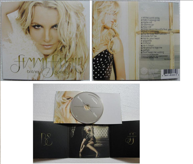
Britney Spears, Femme Fatale- Digipack

Britney Spears, Femme Fatale- Digipack

Britney Spears is a very famous female artist. Her main genre is pop which normally appeals to a younger audience, saying this as the digipack is quite simplistic she may be targeting an older audience in this album.
The front cover of the digipack is very light, Britney Spears is shown with a close up shot, she is looking directly at the camera. Her hair is wavy and she has heavy make up on. She is looking seductive which may draw male attention to the CD. Britney's name and album title are displayed in big letters, the font is very girly and in keeps with the gold writing theme. The main image takes up the most of the front cover, this is because she is well known, and who people will recognise, this may draw someone into buying it.The back of the Digipack also has Britney on, she is wearing a different outfit and looking away from the camera towards the list of songs. A window is in the picture, and the font is black to stand out from the light background. The inside of the digipack is very simple, on the left panel is the initials of her name and on the right is the initials of her album. In the middle panel there is a photo of Britney she is sitting down wearing a short dress, dark eye makeup and she is looking directly at the camera in what looks like a nightclub.


Thursday, 22 September 2011

Leona Lewis, Spirt - Digipack Cover Research


Leona Lewis, Spirit- Digipack Research 


I think this is a very effective, simple digipack as it stands out, so fans looking at Cds will notice her cd straightaway. This close up of Leona Lewis's face is very seductive and sexy, her lips are emphasized and her hair is made up, thereby perhaps appealing to males. The white typography of Leona Lewis's name stands out in contrast with the dark background, meaning it is noticeable for the viewers, as well as the yellow typography indicating the name of her album.


This is very simplistic but works well, the yellow typography stands out. The songs included in the album are printed on the cd which is rare. I want my cd to be similar to this as i'm considering having a stand out picture on the front cover of my digipack and i think it may be too much if i have a picture on the cd. 


Same goes to the back of the digipack, very simple, the animation of the flowers going down each side is girly, pretty and adds something to the cover. The white font is small but stands out against the black background. I would consider using a type of animation on my digipack. 

Friday, 16 September 2011

Beyonce, B-day Digipack

Beyonce- B-day
Digipack


I like the way depth of field is used here, she in in focus and the background isn't therefore makes her stand out.  Beyonce is looking very seductive and sexy, her lips have been enlarged, and she is wearing a low cut dress showing her cleavage, this may attract a male audience.  For being outside she is wearing heavy make up with dark black eyes and has her hair up. The white typography stands out over the dark green background, the font is girly and i like the thin animated swirls around it. Having a clear picture of Beyonce taking up the majority of the Cd will attract fans and people in general as she is very well known. 


This is a very plain Cd, the background colour is beige which makes the white typography stand out. The cd contains Beyonce's name and album name, again with animated swirls round the font, the songs in the album, and the information on manufactures e.c.t.