Evaluation 2
How effective is the combination of your main product and ancillary texts?

My Digipack
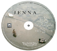
The combination of my main product and ancillary tasks are very effective as it is clear from the images above that there is a continues style throughout all the products, which is a London indie theme. Although my poster does not completely blend in with my theme throughout the other products, i chose the black and white image as it goes in with my genre. These images were taken when i was away with the actress, in London. I have used the same font for the singers name on the front cover as on the poster. The colours which appear within my task are all fairly similar due to the image I was trying to give off which was a naturalistic and chilled out atmosphere therefore I used soft but dark tones in order to achieve this.
My locations in my music video are different to my ancillary tasks, allow if they were the same it would have blended more but i think because of the indie genre and the varied song i have changed the locations. I like the medium shot in the poster as it shows the actress in more detail compared with my digipack.
 My Digipack


No comments:
Post a Comment